Showing posts with label design. Show all posts

Wednesday, December 28, 2016

What we're looking for in SaaS in 2017

As the year is coming to an end I’d like to share a few thoughts on what we’ll be looking for in the SaaS world in 2017. This is not meant to be an exhaustive enumeration but rather a brief outline of a few big themes that I feel particularly strongly about.

1) Viral growth and/or negative churn

In the last couple of years I’ve come to the opinion that in order to build a SaaS unicorn you need to have either (a) a highly viral customer acquisition engine or (b) significant negative net churn (that is, a dollar retention rate significantly above 100%). The rationale behind this statement, which might seem odd at first sight, is actually simple math. If you don’t have negative net churn you’re losing an increasing amount of MRR every month to churn, simply because your churn rate is applied to an ever-increasing base. That means that as long as you have positive net churn, you’ll have to add an increasing amount of new MRR from new customers every month just to offset churn. As you’re getting bigger and bigger it will become extremely difficult to maintain a high growth rate if you have to replace an ever-increasing amount of churn – unless you have an inherently viral product.

At a somewhat theoretical level, what I’m saying is that since net churn MRR grows as a function of your MRR base, you better have a mechanism that lets you add new MRR as a function of your existing base as well. I know this is a somewhat simplified way of looking at it and I’m sure there are a few exceptions to this rule, but I’m convinced that almost all SaaS startups that want to become big should strive for viral growth, negative churn, or both.

Related posts (from this blog):

2) Obsessive focus on user experience

Companies like Slack or Zendesk have shown that a superior user experience can provide a decisive competitive advantage and can become a critical success factor for SaaS businesses. Pundits might object that you don’t win enterprise customers by having a prettier interface. I think that’s shortsighted for at least two reasons.

First, user experience is not only about making the UI more beautiful. As legendary UX expert Jakob Nielsen defines it, “user experience encompasses all aspects of the end user's interaction with a company, its services and its products”. An excellent user experience requires an elegant product that meets the needs of the customer and is a joy to use, but it goes beyond that. The design of your marketing website, the tone of voice of your marketing emails, interactions with customer service – all of this is part of the experience that you offer.

Second, today more and more buying decisions are made by the actual users of the software (e.g. someone in marketing looking for a marketing automation solution) as opposed to the IT department. When the buyer is also the user, usability becomes one of the key decision criteria.

This decentralization of software buying, which has led to the consumerization of enterprise software both from a product as well as a go-to-market perspective, is maybe the most important driver of change in the software industry that we’ve seen in the last 5-10 years. But it’s far from over. Millennials arguably have even less tolerance for slow, bloated, ugly enterprise software. If you grew up with UBER and Spotify, if you’ve never ordered a cab by phone and never went to a store to order a CD, chances are you expect your work software to work flawlessly as well. :-) As millennials continue to rise up the ranks, a focus on great design and a delightful user experience will become even more important for software companies.

Two of our most successful SaaS investments to date, Zendesk and Typeform, owe a large part of their success to what I like to call a “10x” improvement in user experience over the status quo. It will be extremely interesting to see which companies can accomplish a similar quantum leap in 2017 and how it will look like. Will it be a SaaS solution with voice as the primary form of input? A mobile-first SaaS app that truly leverages the smartphone’s camera, sensors and other applications to provide a 10x better user experience? Or a software with a conversational interface, powered by a bot? I don’t have the answer, but I’m pretty sure that new ways to input data – methods that are more natural than dropdown menus or smartphone keyboards – will be a part of it.

Further reading:

3) Smarter software and more automation

Up until recently, the main job of software was to make people more efficient by digitizing paper-based processes, doing calculations and enabling more efficient communication inside and between companies. This has led to huge efficiency gains, and I honestly have no idea how companies used to be operated without computers until 40-50 years ago.

And yet, the biggest disruption is still ahead of us. I am, of course, talking about artificial intelligence (AI). How long it will take until AI will reach human intelligence – or if that’s never going to happen – is an extremely interesting topic that goes far beyond the scope of this post (and of course one that I’m not an expert in). It’s safe to assume, though, that software is getting better and better at more and more tasks which were previously thought to be impossible for computers to learn. Watson’s victory against two “Jeopardy” champions a few years ago and AlphaGo’s win against one of the best Go players are two legendary examples, but there are lots of other, less publicized cases, of computers winning against humans.

If close to 50% of jobs will be done by computers in the not too distant future, as an Oxford University study suggests, this will of course have unprecedented consequences for our society. How those consequences will look like, and if the net impact will be positive or negative for most people, is another extremely interesting topic that I’m not going to delve into here. What’s clear is that this disruptive force will create enormous opportunities for SaaS companies.

With today’s software it can sometimes be hard for a SaaS startup to prove the ROI of its product to prospective customers. Putting a dollar sign on the efficiency gains that a customer can realize by using your software can be difficult, and your product may provide lots of pretty intangible benefits that are hard to quantify. Now imagine that your SaaS solution allows your customers to get work done with significantly less people or maybe no people at all. In that case, the ROI will be pretty obvious.

What if future versions of sales automation software will not make your sales force more efficient but become your sales force? I can’t imagine how bots could take over sales calls … or wine and dine with a client. :) But think about jobs like web-based prospecting, lead qualification or email campaigns and the idea starts to sound a lot less far-fetched.

Although we developed a strong interest in AI in the last few years we have not yet seen a large number of “AI startups” that we fell in love with (one notable exception is our portfolio company Candis, which is automating accounting work). This could be because the industry is still at a nascent stage or because it’s still early days for us in terms of learning and developing an investment thesis around AI, or both. In any case, we’re excited to spend more time on this topic in the coming year!

Further reading:


Friday, July 17, 2015

The evolution of the SaaS landing page

When you look at the landing pages (or homepages or marketing sites, however you want to call them) of today's SaaS companies, they usually look quite beautiful. They typically have a clean, simple and friendly look, with very little text and a lot of images or videos. In many cases, these websites could just as well advertise a consumer product. This doesn't come as a surprise, since the consumerizaton of enterprise software has been one of the most important driving forces in the software world in the last years. But B2B software websites haven't always looked like this and it's fascinating to see how much things have changed. Join me as I go back in time and take a look at how SaaS landing pages looked like some years ago.


The SaaS Stone Age

Fast-backward about 16 years. This is how the website of Salesforce.com - the most innovative software company of that time – looked like in 1999:

Salesforce.com in 1999
(click for a larger version)

Interestingly, as horrible as the site looks by today's standards, it does have a bit of a consumer-ish feel and it actually became more enterprise-y over time (you can browse the history on the Internet Archive, which I've used to take these screenshots). So maybe in 1999 and the early 2000s the world wasn't ready for consumerization yet, or Salesforce.com didn't figure out the right approach or they just saw more success with a top-down enterprise sales approach.


The Beginnings of Modern (SaaS) Times

Not much happened on the SaaS design front in the following years. Until 2004, that is, when a small, Chicago-based web design agency called 37signals launched its project management tool called Basecamp:

Basecamp in 2004
(click for a larger version)

Basecamp looked radically different from any other piece of B2B software. If it's possible to pinpoint the beginning of modern SaaS to a specific company or product, I think this honor is due to Jason Fried and his colleagues at 37signals. As much as I disagree with Jason on many things he writes about how to build a business – kudos to 37signals for their focus on product, design and usability. No other SaaS company had a bigger influence on SaaS design.

It took a few years – which shows how much ahead of its time 37signals was – but eventually other SaaS companies redesigned their websites or rebuilt them from the ground up:

Campaign Monitor in 2008
(click for a larger version)

The trend was clear: Less and less text, bigger font sizes, larger images, videos. SaaS companies which were founded at that time had a stronger focus on design from the get-go:

Clio in early 2009
(click for a larger version)
Zendesk in 2010
(click for a larger version)

Contemporary SaaS Design

In the years that followed, the trend towards simplicity, focus on design and consumerization continued, and I'd say that since around 2012 or 2013, having a reasonably beautiful and conversion-optimized marketing website is more or less table stakes. Today you can buy a SaaS landing page template for $18. A $18 design which looks better than every B2B website that was built before 2004 – makes me wonder if Moore's law applies in design, too. ;-)

Since most people are trend-followers rather than trend-setters, SaaS landing pages started to look more and more alike in the last few years: A navigation bar at the top; 1-2 devices that were made in Cupertino, with product screenshots on them; a large headline and smaller sub-headline; 1-2 call-to-action buttons; some customer logos. This (plus a few other things) was the anatomy of almost every SaaS landing page in 2014. Not bad, don't get me wrong, but if everyone follows that recipe it gets harder and harder to stand out and build something memorable.

But just when things started to get boring, some cutting-edge design-led SaaS companies pushed the envelope further:

Geckoboard's current website
Go to www.geckoboard.com to see it live
Typeform's current website
Go to www.typeform.com to see it live
Another view of Typeform's current website
Go to www.typeform.com to see it live

Both examples make heavy use of video so the screenshots don't do them justice. Please go to Geckoboard and Typeform to see them in action. While still being focused on conversion, I think these websites are almost indistinguishable from art. Using high-quality video footage, very little text and beautiful typography, crafted with incredible attention to detail, these websites bring across a  value proposition in a fresh, unique and highly emotional way.

This little journey through time has shown that up until now, the evolution of the SaaS landing page has been a development towards ever more simplicity. It will be interesting to see if this trend continues in the coming years.


Disclosure: I'm an investor in Clio, Zendesk, Geckoboard and Typeform.

Sunday, July 27, 2014

A/B testing is like sex at high school

A few days ago I went on record saying that A/B testing is like sex at high school. Everyone talks about it, not very many do it in earnest. I want to follow up on the topic with some additional thoughts (don't worry, I won't stretch the high school analogy any further).

When talking to people about A/B testing I've noticed that there are four (stereo) types of mindsets which prevent companies from successfully using split tests as a tool to improve their conversion funnel.

1) Procrastinative

The favorite answer to suggestions for website or product improvements from people from this camp is "we'll have to A/B test that" – as in "we should A/B test that, some time, when we've added A/B testing capability". It is often used as an excuse for brushing off ideas for improvement, and the fallacy here is that just because the best way to test assumptions is an A/B test doesn't mean that all assumptions are equally good or likely to be true.

Yes, A/B tests are the best way to test product improvements. But if you're not ready for A/B testing yet, that shouldn't stop you from improving your product based on your opinions and instincts.

2) Naive 

People from this group draw conclusions based on data which isn't conclusive. I've seen this several times: Results are not statistically significant, A and B didn't get the same type of traffic, A and B were tested sequentially as opposed to simultaneously, only a small part of the conversion funnel was taken into account – these and all kinds of other methodological errors can lead to erroneous conclusions.

Making decisions based on gut feelings as opposed to data isn't great, but in this case at least you know what you don't know. Making decisions based on wrong data – thinking that you understand something which you actually don't – is much worse.

3) Opinionated

There's a school of thought among designers which says that A/B testing lets you find local maxima only. While I completely agree with my friend Nikos Moraitakis that iterative improvement is no substitute for creativity, I don't see a reason why A/B testing can't be used to test radically different designs, too. 

Designers have to be opinionated. Chances are that out of the 1000s of ideas that you'd like to test, you can only test a handful because the number of statistically significant tests that you can run is limited by your visitor and signup volume. You need talented and convinced designers to tell you which five ideas out of the 1000s are worth a shot. But then do A/B test these five ideas.

4) Disillusioned

The more you learn about topics like A/B testing and marketing attribution analysis, the more you realize how complicated things are and how hard it is to get conclusive, actionable data. 

If you want to test different signup pages for a SaaS product, for example, it's not enough to look at the visitor-to-signup conversion rate. What matters is the entire funnel conversion rate, starting from visitors all through the way to paying customers. It's well possible that the signup page which performs best in terms of visitor-to-signup rate (maybe one which asks the user for minimal data input only) leads to a lower signup-to-paying conversion rate (because signups are less pre-qualified) and that another version of your signup page has a better overall visitor-to-paying conversion. To take that even further, it doesn't stop at the signup-to-paying conversion step as you'll want to track the churn rate of the "A" cohort vs. "B" cohort over time.

If you think about complexities like this, it's easy to give up and conclude that it's not worth the effort. I can relate to that because as mentioned above, nothing is worse than making decisions which you think are data-driven but which actually are not. Nonetheless I recommend that you do use split testing to test potential improvements of your conversion funnel – just know the limitations and be very diligent when you draw conclusions.

What do you think? Did you already fall prey to (or see other people fall prey to) one of the fallacies above? Let me know!


Monday, December 17, 2012

The 4th DO for SaaS startups – Make your website your best marketing person

If you're building a modern SaaS solution for the Fortune 5,000,000, the importance of your marketing website cannot be overstated. In the old world of enterprise software, most software vendors used to have pretty lame websites. Most of them were poorly designed and looked very technical and uninspiring, and the only images they contained were the seemingly obligatory stock photos (suit-wearing business people trying to out-smile each other, handshake close-ups and of course an attractive headset-wearing woman – often the same one on multiple vendors' sites!). Compare that with the website of a modern SaaS solution like Zendesk and I'm sure you'll understand what I mean.

To be fair, those old-school software vendors were probably able to afford having bad websites since the Internet just wasn't their primary sales or marketing channel. By contrast, if you market a SaaS application using a low-touch sales model, most of your customers will have very little interactions with your sales team, which turns your website into the face of your company. Use this as an opportunity to make your website your best marketing person!

The primary objective that your website has to achieve is clear: attract as many visitors as possible (mainly by providing great content, more on that in a later post) and turn as many of them as possible into trial users. There can be a number of secondary goals like collecting email addresses of visitors who aren't ready to start a trial yet, generating interest from and providing information for partners, informing about job openings at your company, transporting your brand image and so on, but getting visitors to try your product is clearly the most important one. As such your site needs to combine a convincing, simple value proposition, which catches the visitor's attention and makes him want to learn more, with a clear and highly visible call-to-action (hello, AIDA).

If you're new to SaaS, probably the best way to get started is to take a look at a number of successful SaaS websites. Great examples include Xero, MailChimp, CampaignMonitor, Harvest and SquareSpace. For some examples from our own portfolio, check out Zendesk, FreeAgent, Clio, Vend or Geckoboard, to name just a few. If you take a look at these and maybe other sites you'll see that they have a number of elements and characteristics in common:

  • Beautiful imagery of the software (good screenshots, photos showing the app on Apple hardware) which makes you want to give it a try
  • A screenshot tour and/or videos that let you easily learn more
  • Brief information about the key value propositions on the homepage, with links to more comprehensive information about the product on sub-pages
  • An easy to find link to a clean pricing table so that the visitor doesn't have to search for pricing information
  • Quotes from customers and the press and sometimes security certificates or awards to show credibility
  • Highly visible buttons for the key calls to action (usually "Sign up" and "Take the tour")
  • A simple signup form with as few mandatory fields as possible in order to minimize the barrier to sign up
For an example and some additional notes, here's a wireframe that I created for my portfolio company samedi some time ago and which became a part of the briefing that we gave to the graphical designer:

(click on the thumbnail for a larger version)

Notes and bonus tips:
  • Looking at existing SaaS websites and my notes above will give you a good sense for the typical anatomy of a modern SaaS site, and since a lot of thinking and often A/B testing went into them you can deduce some best practices by analyzing these sites in detail. However, this shouldn't stop you from trying your own ideas and from trying something completely new.
  • Keep it simple. Just like your product needs to allow for gradual discovery, your marketing website also needs to start with a simple, compelling value proposition and keep the more detailed information for the sub-pages. Interestingly, if you look at the evolution of popular SaaS sites you'll often notice that they got simpler and simpler over time. Example: This is how Basecamp looked like in 2006, and this is how it looks like today.
  • I've mentioned secondary conversion options above. It's important that you offer something to visitors who are interested in your product but aren't ready to take a trial yet. It can be a newsletter subscription, a callback button, a whitepaper download, a live chat window or signing up for a webinar, to name some options. Ideally it allows you to get the visitor's email address so that you can reach out to the user later.
  • This may not be relevant for you right after the launch, but at some point in time you should try to personalize your homepage based on information that is available about the visitor and see if it has a positive effect on conversion. One simple way to do this is to customize the page based on the user's location A site like Clio, for example, could use geo-targeting to tell a visitor from, say, New York how many lawyers from New York Clio has among its customer base already or show case studies from Clio customers in New York.


Tuesday, April 22, 2008

A nice way for your beta site to say "Feedback please"

Have a look at the screenshots below:


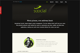
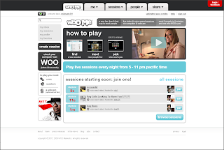
What do these otherwise completely unrelated Web 2.0 sites have in common? Instead of the good old "Send Feedback" link in the page footer, all three of them prominently feature a large, red, eye-catchy "beta feedback" badge.

If you click on the badge, a window that contains the feedback submission form pops up; usually instantly, without a full page reload, so you can type in your feedback right away. Often the background of the page is greyed out, producing a lightbox effect which puts the feedback form into full focus.

I think this is a smart advancement of the notorious Web 2.0 beta badge. If you’re featuring the "Send feedback" link so prominently, firstly and obviously more people will notice it and provide you with valuable comments, bug reports and suggestions. Secondly, you show your audience that you really care about what your users think. Consider using this emerging UI pattern - at least as long as you’re in public beta (which you might be forever).