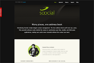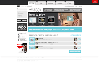


What do these otherwise completely unrelated Web 2.0 sites have in common? Instead of the good old "Send Feedback" link in the page footer, all three of them prominently feature a large, red, eye-catchy "beta feedback" badge.
If you click on the badge, a window that contains the feedback submission form pops up; usually instantly, without a full page reload, so you can type in your feedback right away. Often the background of the page is greyed out, producing a lightbox effect which puts the feedback form into full focus.
I think this is a smart advancement of the notorious Web 2.0 beta badge. If you’re featuring the "Send feedback" link so prominently, firstly and obviously more people will notice it and provide you with valuable comments, bug reports and suggestions. Secondly, you show your audience that you really care about what your users think. Consider using this emerging UI pattern - at least as long as you’re in public beta (which you might be forever).