If you’re a long-time reader of my blog (or if you know me personally) you’ll know that cohort analyses are one of my favorite tools for getting a deeper understanding of a product’s usage. Cohort analyses are also essential if you operate a SaaS business and want to know how you’re doing in terms of churn, customer lifetime and customer lifetime value. I’ve blogged about it before and have included “Ignore your cohorts” in my “9 Worst Practices in SaaS Metrics” slides.
My feeling is that over the last 12 months the awareness for the importance of cohort analyses has grown among startup founders. One reason may be that thought leaders like David Skok have been writing about the topic, another reason are web analytic tools like MixPanel and KissMetrics that make it simple to create cohort analyses.
And yet, many founders are still having difficulties with cohort analyses, be it with the collection of the data or the interpretation of the results. With that in mind I wanted to create a simple cohort analysis template for early-stage SaaS startups.
You can download the Excel file here.
The idea is that you have to enter only a small amount of data and everything else is calculated automatically. Specifically, what you’ll have to type in (or import from a data source) is the basic cohort data: How many customers did you acquire in each month and how many of them were retained in each subsequent month. If you also want to see your churn on an MRR basis and get a sense for your CLTV, you’ll also have to enter the corresponding revenue numbers.
If you’re not sure how to read a cohort analysis, here’s a quick explanation:
Here are some brief notes on each of the arrays in the sheet:
A1: This is where you enter the raw data. Start with January 2013 and enter the number of new customers that you’ve acquired in that month. Then move to the right and enter how many of those January 2013 customers were still customers in February, March, April and so on. Then move on to the next row. If your data goes further back than January 2013, extend the table accordingly.
A2 and A3: A2 takes the data from A1 and shows it in “left-aligned mode”, making it easier to compare different cohorts. As you can see the columns have changed from specific months to “lifetime months”. A3 shows the number of churned customers as opposed to the number of retained customers. Both A2 and A3 aren’t particularly insightful to look at per se, but the data is necessary for the calculations in B1, B2 and B3.
B1: Shows the percentage of retained customers, making it easy to see how retention develops over time as well as to compare different cohorts with each other. What you’ll want to see is that younger cohorts are getting better than older cohorts.
B2. This is kind of like the “inverse” of B1, showing the percentage of churned customers as opposed to the percentage of retained customers. In any given row, the sum of the percentages of churned customers plus the percentage of retained customers equals 100%.
B3: B3 is similar to B2, but the difference is that churn isn’t calculated relative to the original number of customers of the cohort but relative to the number of the cohort’s customers in the previous month. Let’s say you have a cohort with 100 customers and after 6 months the cohort has been reduced to 50 customers. If you lose 5 customers in month 7, this represents 5/100=5% churn in B2 but 5/50=10% churn in B3.
So what’s the correct number? There’s no right or wrong here, it depends on the question that you want to ask. If you want to know e.g. “How many customers do I lose within the first six months?”, B2 (in conjunction with B1) gives you the right answer. But if you want to know what percentage of customers you’re losing per month (important when you look at data across multiple cohorts and for lifetime estimates), take a look at B3.
What you’ll want to see in this table is that after a usually relatively high churn rate in the first lifetime months churn starts to stabilize (because the people who never really adopted the product in the first place are now gone).

C1-C3: Same as A1-A3, just for MRR instead of customer numbers.
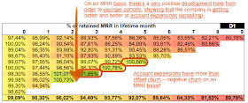
D1-D3: Same as B1-B3, just for MRR instead of customer numbers. What you’ll want to see is that your MRR churn is lower than your customer churn due to account expansions.
Also take a look at the second tab in the Excel sheet, which calculates/estimates customer lifetime and customer lifetime value on a cohort basis. Note that the data is highly speculative for younger cohorts for which there isn’t much data yet.
Further notes are included in the Excel sheets.
If you have any questions or comments, please feel free to reach out!


